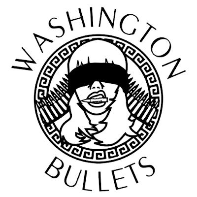
The Washington Bullets brand logo
This was one of my favorite logos to work on. These Washington Bullets are a tag team in the wrestling world and also good friends. The logo was made for merchandise and I did it for free. You start off thinking "oh this is free, I wont put much into it", then I get caught up into it, and I get drawn into a project. So they came me with an idea for a logo that looked like the Versace logo, the lady with the snakes, Medusa maybe? I don't know. So that was the idea, then rest came. In wrestling you have good guys, and bad guys. The goal of the bad guy is to be a person nobody likes, but you also want fans to buy your stuff. Catch 22. I knew from the beginning that I wanted this logo to be a little upsetting, but also cool enough to wear on a shirt. That goal was accomplished by creating a woman that was blindfolding and holding a 50 cal. bullet in her mouth.
Yeah.
Like I said, I wanted to create emotion and I feel I accomplished that. Racial overtones, the violence implied, all wrapped up in the trappings of a glitzy high fashion logo. Emotion at just a glance, and cool enough to put on a shirt, and I think it works.
Yeah.
Like I said, I wanted to create emotion and I feel I accomplished that. Racial overtones, the violence implied, all wrapped up in the trappings of a glitzy high fashion logo. Emotion at just a glance, and cool enough to put on a shirt, and I think it works.

Comments
Post a Comment