New York Liberty Redesign Project
In the first post of this refocused blog, I'm gonna be discussing my latest project n the New York Liberty. Most of the redesigns that I do unless noted otherwise are for fun, so if you see any resources that look like stock photo, it may be. No one is getting paid from this, and any stock stuff I use has been modified by yours truly. I just want to finish the idea and get it out of my head as soon as possible.
Now.
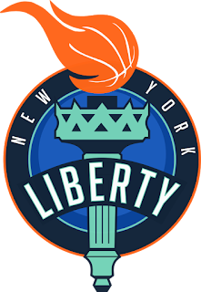
I was watching ESPN one night and a WNBA game was on, the first thing that stood out was the New York Liberty logo. I don't want to disparage or talk bad about another probably more successful artist, but the logo was showing its age. The original was created in the late 90's, when everything had black, was 3D, and was snarling at you. The team currently use blue, orange, a mint teal color, and black all over the place. It's kind of a mess. So what I did first was scrap the black in favor of dark blue. same effect, it just looks better. we can make that blue dark as you want, but it shouldn't be black. Next, we took the teal and made it more trim. Originally they used it to color the Statue of Liberty in the design, and I kept that, but reduced it's use. Speaking on Lady Liberty, I only focused on the torch. Keeping the whole statue in seemed gaudy design wise to me. One thing that I thought was awesome from the original design was the basketball in the flame of the torch. That definitely had to stay.
I'm still working on a secondary mark, and when that finishes I'll update asap, but for now, enjoy my version of the New York Liberty.
Stephen V
 |
| Primary |
 |
| Partial |
 |
| Wordmark |

Comments
Post a Comment